A new map ranking the ‘hottest’ customers across thousands of restaurants in New York City has come under fire.
Riley Walz, a 22-year-old computer programmer based in San Francisco, is the creator of the controversial LooksMapping – a website that uses artificial intelligence to collect data and generate maps designed to reflect society’s own superficial tendencies.
In his latest project, titled ‘Finding Which Restaurants the Hottest People Go To,’ Walz analyzed roughly 2.8 million Google Maps reviews from 9,834 restaurants across NYC, Los Angeles and San Francisco – feeding the data into an interactive digital heat map that ranks venues based on the perceived attractiveness of their customers.
Now, the ‘official’ results are in for the Big Apple: Urbani Midtown topped the list as the restaurant with the most consistently ‘hot’ diners, while Jimbo’s Hamburger Palace in Harlem ranked lowest, labeled as attracting the ‘least hot’ foodies.
Though the results may appear superficial, the website isn’t intended to serve merely as a beauty scorecard. Instead, it aims to highlight how society – particularly in major cities – places value on appearances.
‘The model is certainly biased. It’s certainly flawed,’ Walz himself wrote on the website.
‘But we judge places by the people who go there. We always have. And are we not flawed?’ he added.
‘This website just puts reductive numbers on the superficial calculations we make every day. A mirror held up to our collective vanity.’

A new map ranking the ‘hottest’ customers across thousands of restaurants in New York City (pictured) has come under fire, with critics calling it ‘shallow’ and superficial

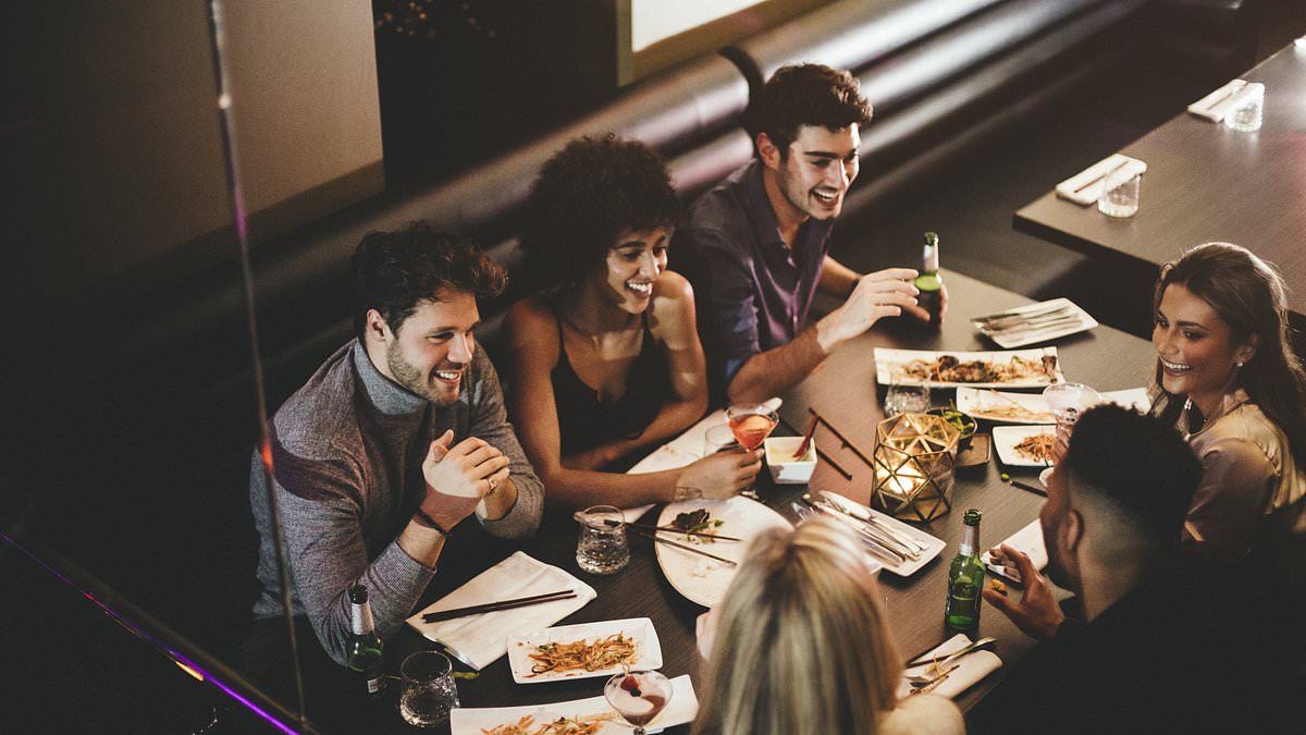
A file photo of a group of friends enjoying a meal on a night out

Riley Walz (pictured), a 22-year-old computer programmer based in San Francisco, is the creator of LooksMapping – a website that uses artificial intelligence to collect data and generate maps designed to reflect society’s own superficial tendencies

In his latest project, titled ‘Finding Which Restaurants the Hottest People Go To,’ Walz analyzed roughly 2.8 million Google Maps reviews from 9,834 restaurants across NYC, Los Angeles and San Francisco – feeding the data into an interactive digital heat map that ranks venues based on the perceived attractiveness of their customers (pictured: results)
The one-dimensional interactive map spans the entirety of New York City’s grid, displaying thousands of color-coded pins strategically placed across the city’s vast network of restaurants.
It uses a scale from 1 to 10 – with 1 representing eateries frequented by the ‘least hot’ diners, marked in shades of blue, and 10 representing those with the ‘hottest’ patrons, highlighted in firetruck red.
By clicking on any of the pins, users can view a restaurant’s rating along with three additional metrics: a scale indicating how ‘hot’ its diners were ranked, an age range distribution of patrons and a gender breakdown showing whether the crowd skews more male or female.
But it raises an important question: how exactly was it determined who qualifies as ‘hot’ or ‘not’?
Walz used a computer model to scrape 2.8 million Google Maps reviews, isolating reviewers whose profile photos featured a detectable face – 587,000 profile images from 1.5 million unique accounts in total, as reported by The New York Times.
Those profile photos were then analyzed using a set of descriptive phrases designed to assess attractiveness, as well as age and gender.
The phrases included: She is attractive and beautiful, he is attractive and handsome, she is unattractive and ugly, he is unattractive and ugly, a young person and an old person.
Relative attractiveness scores were then calculated for each reviewer, though Walz confessed to the NYT that ‘the way it scored attractiveness was admittedly a bit janky’.


Ubani Midtown ranked as having the hottest diners in the city according to the new map


Jimbo’s came in bottom of the rankings. The AI model appeared to favor superficial or arbitrary details when gauging attractiveness – for example, a profile photo of someone in a wedding dress might be rated as ‘hot’, while a slightly blurry image could result in a lower score
The AI model appeared to favor superficial or arbitrary details when gauging attractiveness – for example, a profile photo of someone in a wedding dress might be rated as ‘hot’, while a slightly blurry image could result in a lower score.
‘The model isn’t just looking at the face,’ Walz told the NYT. ‘It’s picking up on other visual cues, too.’
According to the data, the top five Manhattan restaurants with the ‘hottest’ diners -each earning a perfect 10/10 – are Urbani Midtown in Midtown East, Shinn WEST in Hell’s Kitchen, KYU NYC in NoHo, Aroy Dee Thai Kitchen in the Financial District and Thai 55 Carmine in the West Village.
Urbani Midtown describes itself as offering ‘the best Georgian food in a casual and friendly atmosphere that will make you feel like you are eating in Georgia’, according to its website.
‘At our restaurant, we pride ourselves on serving authentic Georgian dishes using fresh ingredients, time-honored recipes and a commitment to excellence,’ the site reads.
On the opposite end of the spectrum, the five New York City eateries ranked as having the ‘least hot’ diners were Jimbo’s Hamburger in Harlem, Hop Won Express in Midtown East, Cocotazo in East Harlem, Malone’s Irish Bar & Restaurant in Midtown East and Michael’s New York – also in Midtown East.
Jimbo’s Hamburgers describes itself as a spot that ‘has everything’, offering a wide range of options from breakfast items and burgers to sandwiches and salads, according to its website.
‘Jimbo’s! You already know the deal – delicious food, your way, every day. We don’t say no to your requests; we make ’em happen!’ the description reads.


‘We might as well be a historical landmark now – and trust us, big things are coming that you don’t want to miss. Let’s keep the tradition alive and keep Harlem and Bronx tastes strong!’
The results of the project also underscore broader concerns about the flaws in AI-powered models – including the potential for racial and cultural biases in how attractiveness is assessed.
Berkeley-based food writer Soleil Ho was just one person who found flaws in the rankings – specifically across San Francisco, as reported by The New York Times.
‘The algorithm seems to have a thing for Asians, and a bias against places that are Black-owned and/or in Black neighborhoods,’ they said in email to the outlet.
When Walz first shared the project on X, dozens of responses pointed to the ‘red-to-blue gradient’ across the city, arguing that the rankings appeared unfair and biased.
The ‘hot’ diners, represented by red pins, are predominantly clustered in affluent, majority-white neighborhoods, while the pins turn blue – indicating lower attractiveness scores – as you move closer to the Bronx.
‘It’s making fun of AI,’ Walz told the NYT. ‘One of the ugliest restaurants is a country club.’
Walz was also one of those previously behind Mehran’s Steak House, a fake restaurant with a near-perfect Google rating that opened for one night in 2023.